Blog 7 ways to improve your user testing reports
Research findings can live or die by how you communicate them. Follow these steps for more engaging user testing summaries.
Picture the scene. You’ve just completed a lengthy user testing study of a website or app. Moderating and analysing those sessions took some time, but you’ve gotten some great findings. Armed with this research, you know exactly how to improve the design. Great!
The thing is, you can’t jump straight into making these fixes.
Assuming you work as part of a larger team, you’ll probably need those changes approved. This means sharing your findings. Whether it’s to your teammates, your boss or your client – you’ll need them to understand (and agree) what you’ve learned.
But what happens if they don’t agree?
What if they don’t engage with the results, or even believe your suggestions?
If user testing findings are presented poorly it can be a disaster. Taking the right steps to create an effective report can make all the difference. Without further ado, here are 7 steps for communicating your user testing results more effectively.
1. Keep it short and sweet
During my studies, I was taught very specific methods for conducting and reporting on user testing. Given the nature of academia these techniques were what you’d expect. Overly formal and bit long-winded (sorry, academic friends!).
Looking back at the user testing reports I wrote in the early days of my career, I feel a bit embarrassed.
They included all of the nitty-gritty technical details I’d been taught to think about. I produced 100-page monstrosities stuffed full of complicated tables, graphs and waffly write-ups. Yuck.
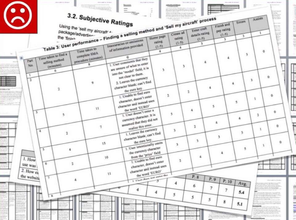
Looking back at my early user testing reports, they’re embarrassingly long-winded
I was naive. I thought I was being thorough. I was actually boring my readers to tears. Because the reports were so hefty, people were put off from reading them. They created the exact opposite effect that I wanted.
A better structure
In a previous post I discussed the importance of keeping your user testing casual. The same thing applies to reporting, too. William Shakespeare once said “Brevity is the soul of wit”. By this he meant that to engage your audience, you’ve got to keep things punchy.
The faster you can communicate your insights, the less of your reader’s busy day you’ll be taking up. Trust me, they’ll thank you for it.
Here’s what I’ll include in a user testing report these days :
- Study objectives: A very brief background to the test. What did we want to learn? (1 page).
- Participants: For each participant provide a name, age, photograph and job role. That’s it. You can link to the sessions recordings too, if you have them. (1 page).
- Executive summary: A bullet-point summary of what we learned. I’ll talk more about this in a minute. (3 pages).
- Results in detail: Discussion of each of the findings, with screenshots. (5-15 pages).
- Next steps: Actions for the team. What happens next to move the project forward? (1 page).
That’s it.
Ideally your report should be no more than 20 pages long. Any longer, and you’re at risk of losing the reader’s attention.
2. Include an executive summary
There will always be those who just won’t read your full report. No matter how punchy you make it, they won’t take the time.
Unfortunately, these are often the senior level stakeholders who will ultimately approve your design decisions. So we need to cater for these people. It’s irritating, but that’s life. Including a brief summary at the very front of your report is the best way to approach this.
Structure for an executive summary
I tend to split the summary into three separate pages.
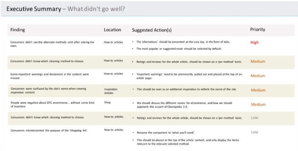
- What went well: What were the positive outcomes from the testing? Which content and features did our testers praise? Which of our original assumptions were validated?
- What went badly: What major issues were uncovered? Which of our original assumptions were proven wrong?
- Other learnings: Were there other useful insights taken from the research that weren’t necessarily good or bad? For instance, did testers use the interface in a way different than expected?
These summary pages should contain really simple descriptions of the findings. Single bullet points if possible. A simple table can work well, too. For each of these points, give a note of the issue severity. Low, medium or high.
The summary doesn’t need to be any more complicated. If the reader wants more detail, then they’ve always got the full report.
3. Show, don’t tell
Most UX designers will know how tricky it is to engage audiences with text alone.
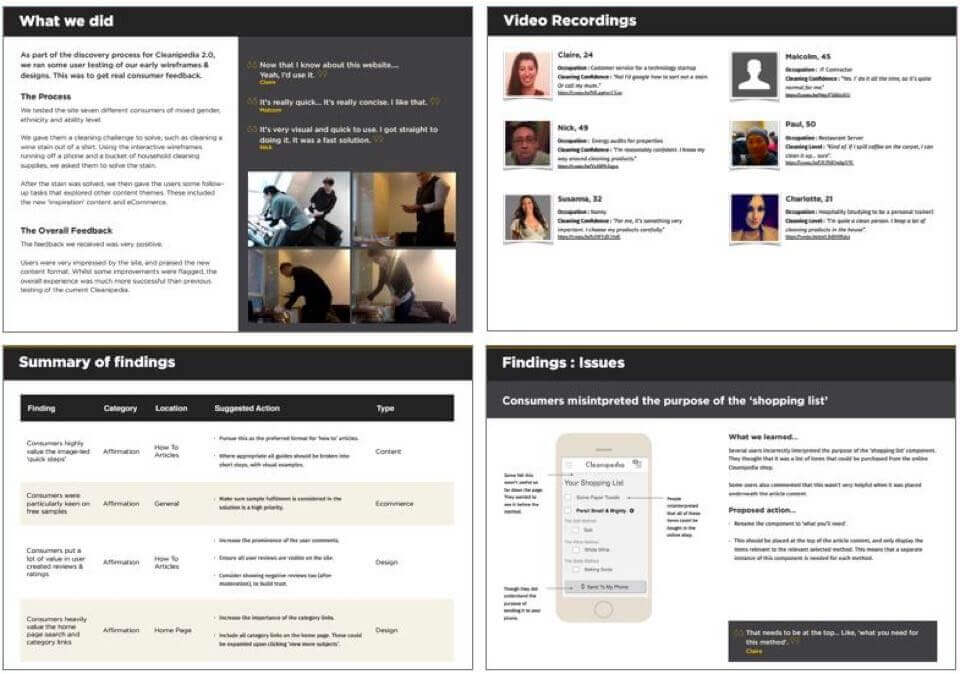
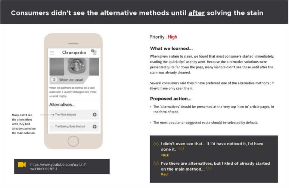
Wherever possible, share your insights using visuals. Rather than writing long descriptions of the situations that occurred, provide an annotated screenshot instead. When discussing a particular insight, I’ll always show the particular screen or state in question.
Even better than screenshots, video clips from your session recordings can help to stress a point. You can easily share specific clips using the ‘start at time’ feature of YouTube or similar players.
If you really want to go the extra mile, video editing tools like Camtasia or Adobe Premier can be used to make montage videos for each issue.
Structure for presenting user testing insights
When producing the ‘results in detail’ section of my reports, I’ll only ever include one insight per page. This is to keep the report easily scannable.
Dedicating a whole page to each issue ensures we keep the report focused. It also gives room to present issues in a more impactful way.
Aim to include :
- A brief description of what we learned.
- An annotated screenshot of the screen or state in question.
- A proposal for how we’ll fix it.
- A link to the video clip(s).
- A couple of quotes that sum up the issue.
That’s all you need. If it takes more than one page to articulate the research finding, then you’re overcomplicating it!
4. Use quotes to your advantage
Speaking of quotes. When it comes to stressing a point, using direct quotes from your participants is incredibly powerful.
A recommendation or insight can be debated, even when supplied by an expert. But nobody can argue with the user themselves. The customer is always right.
Copy down some key quotes for each insight you’re including in the report. These should be short phrases that perfectly sum up the feedback being given, or the issue experienced.
Quotes add character to your report. They help make the results more engaging. The reader will feel like they’ve got more of a direct line to the user themselves, creating a sense of empathy. This will really help them to understand the user’s frustrations, and hopefully agree with your recommendation.
I try to use one or two quotes for each insight in a report. Don’t overdo it though, or they’ll lose their impact. Stick to quality over quantity.
5. Prioritise your findings
Every issue or insight you include should have a priority rating of low, medium or high.
The priority you give an issue should be determined by its impact on the user experience.
If the issue posed a mild inconvenience, then it’s probably low priority. If it outright caused a task failure, or it visibly angered them, you’re probably dealing with a high priority issue. Highlighting the priority of an issue helps the team understand the importance of resolving it.
It’s likely the product you’re testing already has a development backlog. High priority issues need to be addressed as soon as possible, but the lower priority ones could potentially wait for a little while.
It’s also worth indicating whether or not your proposed solution is a ‘quick win’. Sometimes a high priority issue can be resolved with some small minimal tweaks to the design. It’s certainly worth calling them out.
6. Be clear about next steps
A good report should be actionable. We should also close the report with a summary of the next steps.
These are the actions that the whole team need to take following the study. A lot of these will be design or implementation activities to develop your recommendations, but that’s not all. There may also be other requirements.
Next steps could include:
- Follow-up research studies.
- Questions we need to ask of our clients or stakeholders.
- Further presentations or discussions we should organise.
It’s important to break this out as a separate section in your report. It makes your team aware of the process, and what’s expected of them. Your project manager may also need to coordinate these future activities, so it helps make their requirements extra clear.
7. Provide a separate appendix with the full detail (if you need to)
It should be clear by now that your reports should be kept simple.
That said, sometimes there might be a requirement to add some extra details. If you really must share your workings – such as scripts, transcripts or tables – put them in an appendix at the end.
I’ll tend not to do this unless my team or client specifically wants to see this stuff.
Again. It’s all about keeping the report focused for the majority of readers. They don’t need to see what magic happens behind the curtain!
In summary
Just like the products we produce for our end-users, our documentation needs to be useful and usable.
If we’re not engaging our teammates and making their lives easier, we’re not doing our jobs properly. Follow these steps, and your user testing results will go a lot further.
And remember. If in doubt, just keep it simple!

Chris Myhill
— Director of Experience