Blog 7 great website & app ’empty state’ examples
These websites & apps teach us that even when there’s no content to show, you can still offer up something helpful.
We all like to imagine the perfect scenario. Who wouldn’t? Mock-ups full of content and activity look way more interesting. They also help our teams better understand the ideas we are communicating.
That’s all well and good… But when we’re so caught up in the ideal, we sometimes forget the empty states.
An empty state is what’s shown when there’s nothing else to show. For example:
- An activity feed, before I’ve made any connections.
- An events calendar, if there’s nothing scheduled.
- A list of my created content , when I’ve made any yet.
There are many ways to handle empty states. These examples use very different (and effective) approaches to help the user with a well designed empty state.
1. BBC News App
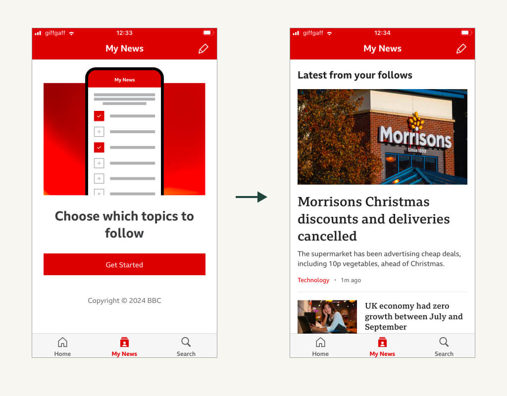
The BBC provides a functional yet effective empty state for the ‘My News’ section. Bold instructions are provided, along with a strong call to action.
It’s straightforward, but it’s a great reminder that empty states don’t need to be complicated. Just considered.
2. Skyscanner
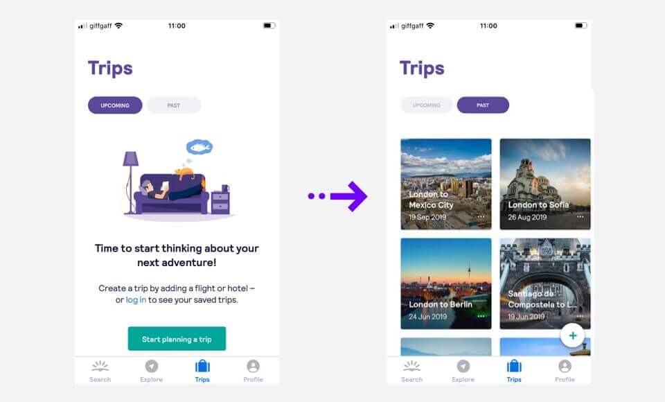
Loading the app for the first time, there’s nothing to see (yet). Where I’d normally see a list of my trips, the app instead uses some lovely illustrations to set the tone.
It’s a beautifully simple. The user-friendly language and images add extra character, providing a great first impression.
3. Trainline
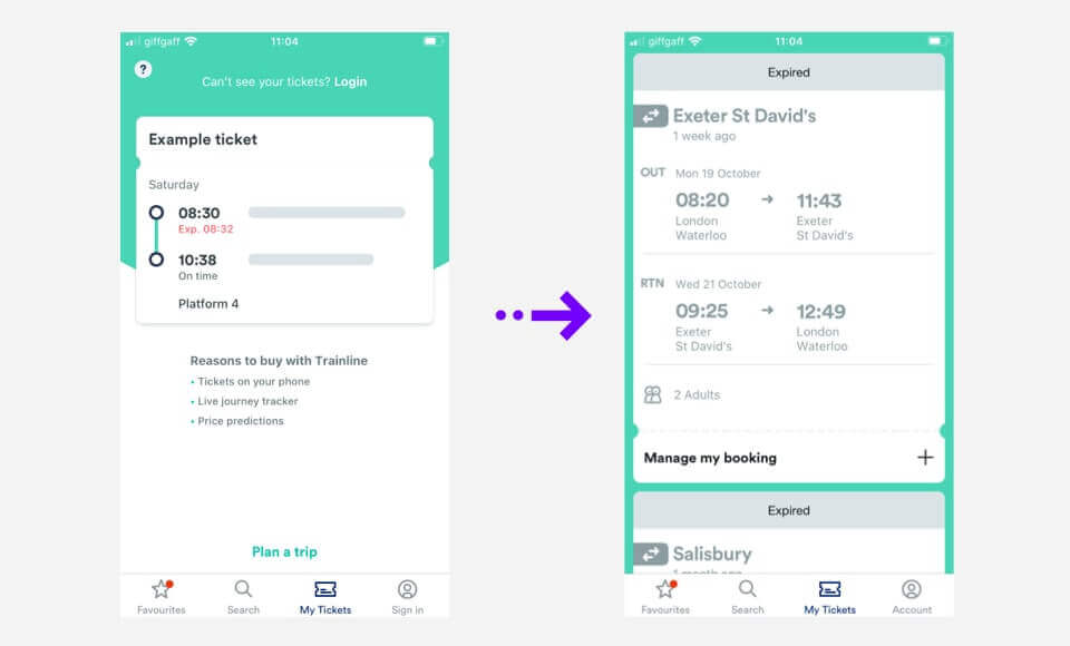
If I’ve not yet booked a journey, Trainline’s ticketing app uses the empty state to show an example.
This helps me understand how the service works, and what I’d normally be seeing on this screen. The remaining space is also used to explain the benefits, with a prominent button to plan a new trip.
4. Todoist
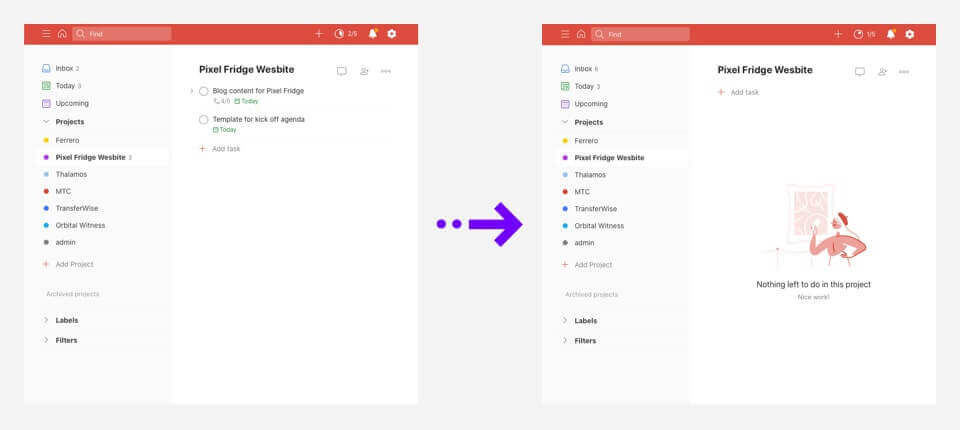
Todoist helps users track and work through their tasks for a given day.
If someone is lucky enough to have cleared their list, the app congratulates them and provides a little surprise illustration. It’s a nice touch to make the empty screen feel a bit more engaging.
5. Spotify
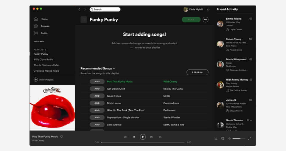
A playlist isn’t much good without songs. After making a fresh playlist, Spotify use the empty state as a way to provide song suggestions right away.
Rather than the empty state being just ‘empty’, Spotify have attempted to introduce something helpful instead. As a bonus, the suggestions stick around and get more relevant as I start adding songs.
6. LinkedIn for businesses
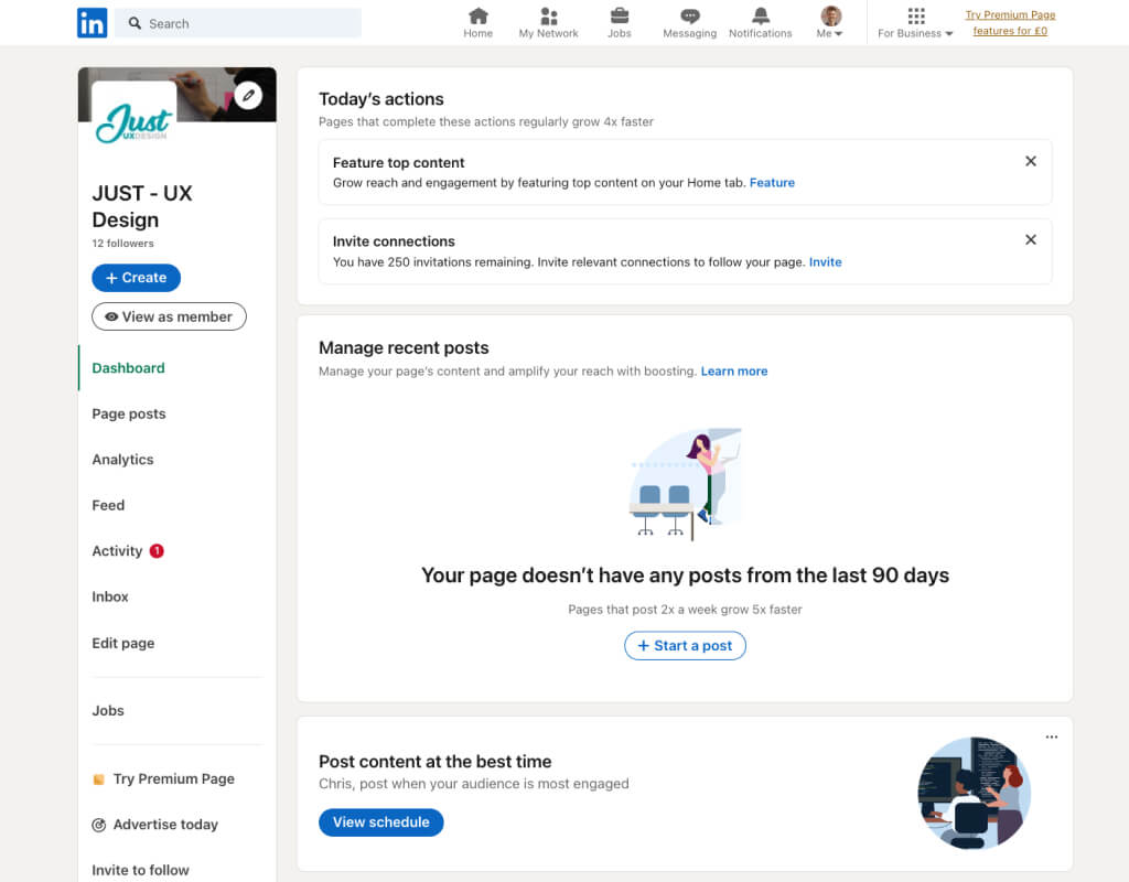
When first setting up a LinkedIn page for a business, there’s a lot of information one could add. There are also loads of different ways to start interacting.
This could be quite overwhelming… But Facebook do a great job of filling the gaps with helpful placeholders, prompts and tips. It gradually draws users into the service, highlighting tasks that haven’t yet completed in the relevant parts of the page.
7. Trello
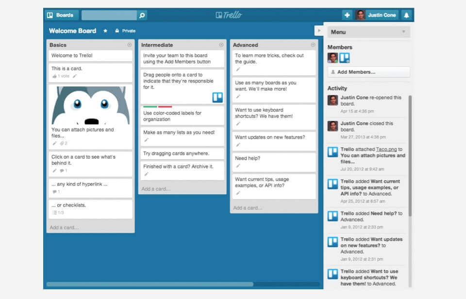
Trello avoid a traditional ‘empty state’ entirely. They do this via the app’s clever onboarding process. Instead of providing lengthly tutorials or explainers, a fresh Trello account opens with a ‘welcome board’.
The welcome board gives users a bunch of little tasks to get them used to the app. Effectively, they train users in the Trello by using Trello. It’s a really neat way to learn the app and sidesteps the need for a conventional empty screen.
Chris Myhill
— Co-Founder