Blog Designing for accessibility and inclusivity
What does it mean to design for everyone?
The success of a design project is determined by its usability. If a given design excludes a group of users because their disability, circumstance or cultural background have been ignored, it simply fails its purpose and shows an unacceptable lack of understanding of the world we live in on the designers’ part.
So what steps can designers take to broaden the project’s reach?
A learning curve
The journey into accessibility and inclusion starts with empathy. At Pixel Fridge, our commitment to understanding our clients’ users and adapting our work practices accordingly is paramount. Taking the time to observe, question and understand is key to recognising the diversity of human needs in various circumstances.
Accessible design responds to industry guidelines that are implemented to assist groups of people with recognised disabilities. Taking this a step further, inclusive design also takes into consideration the diversity of experiences that may exclude certain groups of people because of their specific circumstance.
For example, accessibility guidelines provide recommendations to assist the user who may be deaf or hard-of-hearing. But designing with an inclusive approach means also taking into consideration the user who may be accessing the service in a busy waiting room, unable to turn the sound on on their device. Recognising different circumstances may affect users in diverse ways is a good starting point for ethical and positive design practice.
What does this mean in practice?
With accessibility guidelines and inclusive methods of working, the designer is able to include all users, regardless of their abilities, circumstances or cultural backgrounds.
The below guide is by no means exhaustive, but it provides a solid overview of the various elements to consider as far as accessibility and inclusivity are concerned when designing for the web.
Colour
Colour for contrast
It’s good practice to check all colours used in a design work from a readability perspective. Online tools such as Web Accessibility in Mind (WebAIM) allow the designer to check the contrast level of any given design. Based on the Web Content Accessibility Guidelines published by the World Wide Web Consortium, such tools flag contrast for 2 levels of accessibility: to pass level AA, the contrast ratio must be higher than 4.5:1 for normal text. To pass level AAA, the contrast ratio must be higher than 7:1 for normal text. At the very least, all designs should pass level AA, but ideally aim to pass AAA as well.
Having said that, colour palettes should be carefully considered as far as contrast is concerned: some people experience contrast sensitivity which makes it difficult for them to read black text on white background.
For people with dyslexia for instance, the designer should opt for dark text on light background rather than pure black on pure white.
Users on the autistic spectrum would also find it easier to interact with an interface that has been designed with a simple colour palette rather than bright contrasting colours.
Colour for meaning
The designer should not rely on colour alone to convey meaning. Screen readers do not communicate colour and colour-blind users may not see it either. In the example of an error message, simply highlighting it in red is not enough. This would be assuming too much of the user’s ability to see colour. Accompanying text informing the user there is an error is crucial to enhance the experience of the people with low vision, colour blindness or screen-reader users.
It’s also worth noting that different people can experience colour in different ways depending on their cultural, political, religious or historical associations. Red for instance is associated with happiness and good fortune in China, but it symbolises mourning in South Africa. With a little user research and a clear understanding of the target audience, the designer should always be mindful to take the users’ cultural references into consideration when choosing the appropriate colour palette for the project.
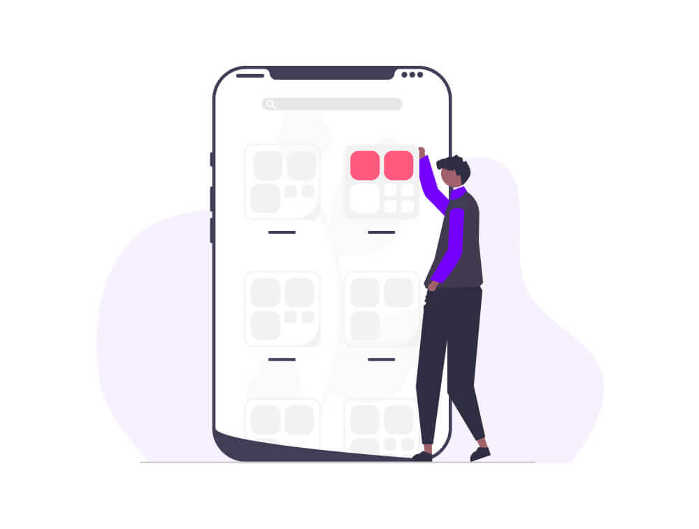
Graphics and multimedia
Including alternative text tags in all images is a great way to optimise the website’s content and allow screen-reader users to obtain a description of those visual elements. Without those, their experience would be lessened and rather disengaging.
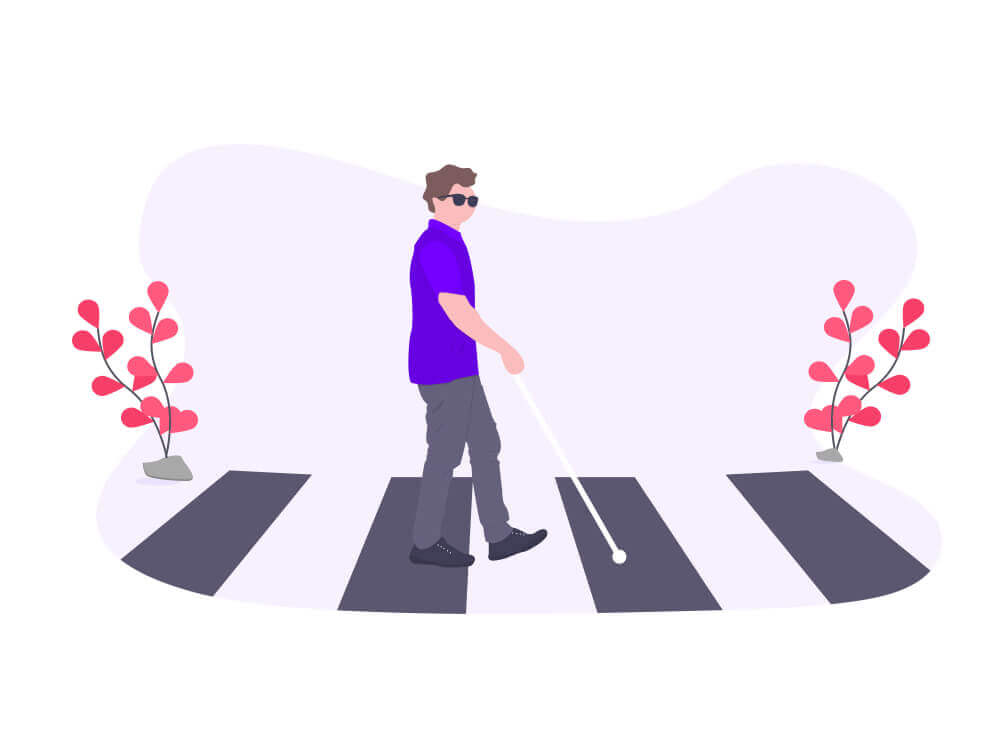
Transcripts or subtitles for video and audio files will similarly deliver a more fulfilling experience for deaf or hard-of-hearing users.
In order to take the user on a journey, it’s important to keep them engaged and introduce them to a relatable experience. The choice of imagery is key to achieving this with authentic and diverse photography. People from all walks of life are likely to land on a given website so it’s important the choice of photography is relatable in order to maximise engagement.
Clickable actions
Direct and precise text descriptions should be prioritised over fuzzy text content, especially when clickable actions are concerned. ‘Get In Touch’ rather than ‘Click Here’ is a more effective way to engage all users informing them of what comes next. As well as keeping users on the autistic spectrum engaged by clearly sign-posting their progress, descriptive text for clickable actions also guides the screen-reader user more effectively.
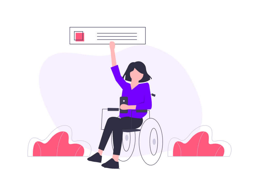
Clickable actions should also be given plenty of space so they stand out more and don’t get missed. Ensuring all users can complete their journey successfully on a given website should be the designer’s primary concern. Users with physical or motor disabilities should not feel overwhelmed or confused when filling out a form online. With a clear and strategically placed call-to-action, they should be on their way to achieve their goal successfully.
Layout and structure
Screen-readers do not pick up on the position of elements on a page. When organising content and building the layout, the designer should take a logical linear approach to the elements’ visual hierarchy, allowing the most important content to be discovered easily before the calls to action. The screen reader will communicate the information in the order it is displayed on the page so for it not to be missed, it must be organised in a logical layout.
Keeping content simple with short line length and consistent left alignment will enhance legibility for everyone. Specifically, users with dyslexia or on the autistic spectrum will process information more effectively if it’s presented in a consistent pattern.
From a structure perspective, a quick win can be achieved with the inclusion of a sitemap to guarantee the user will find what they’re looking for easily, without having to scroll through pages and pages of overwhelming content. This simple step would enhance the experience of many users who may otherwise find it difficult to find their way around a complex navigation.
Text content
A product’s design is the most critical component to its success, and for digital products, text content is one of the most important aspects of the design. It’s like a set of instructions for your latest home appliance. If the manual makes no sense, the product is likely to be useless. Just like the manual for your washing machine, writing for user experiences should avoid jargon and technical language that may discourage the novice user. Sticking to simple and clear messaging will avoid alienating those who are yet to familiarise themselves with your content.
On the other hand, this doesn’t mean the content should be dumbed down to the point where the user feels patronised and undermined. The tone of voice must be adjusted carefully to strike the right balance for the audience, bringing everyone along the journey.
And if time and money were no object?
With a generous budget and ample time to complete a project, the options to make design more accessible and inclusive could be countless.
Customisation can be considered to give the user the opportunity to tailor fonts, colours and text magnification to suit their needs and preferences.
For obvious reasons, translation and localisation can also have a huge impact on a website’s reach. Translation is the process of changing the website’s language into a target language. Localisation goes one step further: as well as translating the content, this process also involves changing some elements to appeal to the user’s location and cultural preferences in their own language. Sadly there are no shortcuts for such enhancements, and they require meticulous planning and flexibility in the design. No matter how tempting machine translation may be, it’s a must that this type of work is carried out by professionals in order to avoid any undesirable blunders.
Empathy for all
The list to consider could go on, but this brief guide demonstrates that accessibility and inclusivity should be top of the agenda at every stage of the design process. Understanding their implications and applying their principles rigorously and with consideration should be integral to the designer’s approach.
As the digital world and its impact on our lives continue to grow, it’s our duty as designers to keep on educating ourselves and adapt our methodology to deliver more accessible and inclusive work.
With more empathy for all, the web can be a better place – and perhaps the world can be too.
Gaelle Monin
— UX / UI Designer