Blog Information Architecture. Why does it matter?
Information Architecture (IA) is the backbone of any good user experience. With so much content in our websites & apps these days, the practice is more relevant than ever.
In the early stages of my design career, my job title was ‘Information Architect’. This was back when User Experience was just a term… and not an entire industry.
At that time, it was fairly common for a designer’s job title to imply a specialisation. My role as an Information Architect mainly focused around planning site structures, navigation and user flows. That was the main focus, but the job also dipped into other parts of the design process such as usability testing and interface design. But mostly, my work revolved around information architecture.
More recently, it has become fashionable for designers to abandon specialist-orientated job titles like ‘Information Architect’ or ‘Interaction Designer’. Designers are encouraged to be more generalist, taking on the broader title of ‘UX Designer’. In spite of this, the practice of information architecture lives on, and remains just as important… even if we don’t hear about it as often. It’s a fundamental activity that is essential to making usable products.
What is information architecture?
When we talk about Information Architecture (IA for short), we’re talking about how we structure the content and functionality of our products. Essentially, it’s the planning of how users will move between the site’s various sections and features.
Like a messy bedroom, websites and apps have a habit of accumulating a lot of ‘stuff’ over their lifespan. When new content and features are introduced, the structure needs to cater for this. Screens quickly become cluttered and unusable. That’s why Information Architecture is an ongoing activity. We need to stay on top of our structures, and continue optimising them as content is changed or added.
Why does information architecture matter?
It helps us to depict navigation structures
Even when it isn’t presented in the traditional way (i.e. the classic ‘nav bar’) we still need to consider the user’s pathway through the websites and apps we create. Before diving into the designs of the screens themselves, we first need to understand how all the pieces fit together.
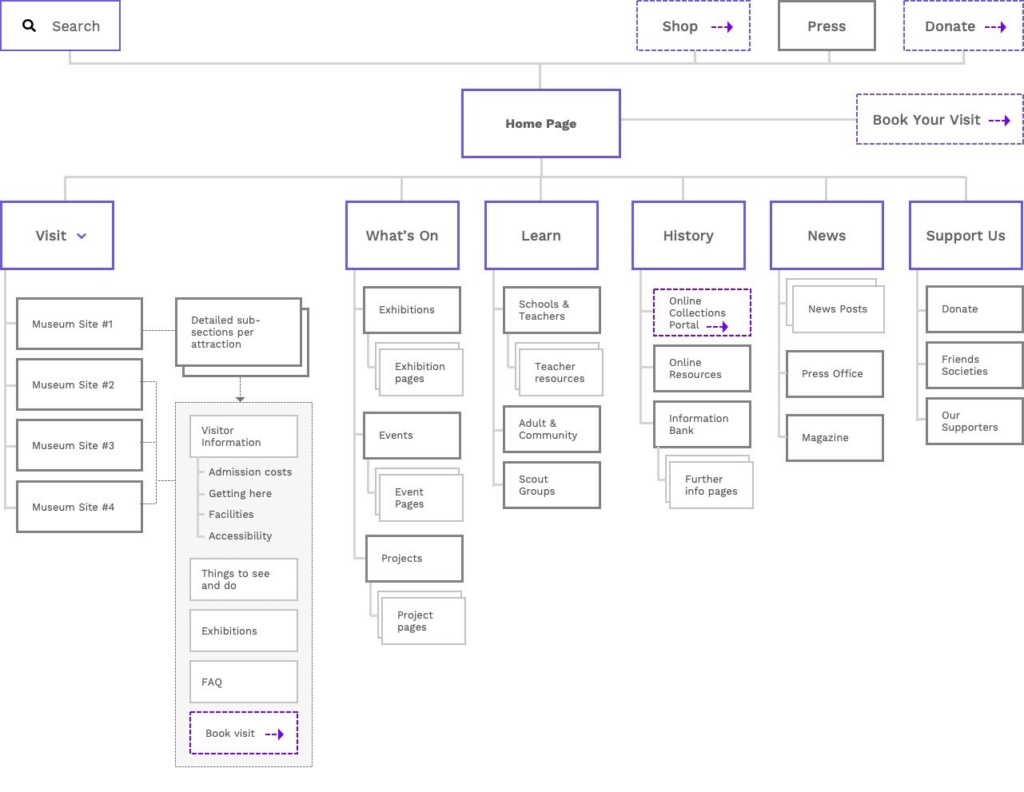
This is where Information Architecture comes in. We can map these requirements using a number of IA techniques :
- Sitemaps. Hierarchical diagrams showing how pages are grouped, linked, and labeled.
- Process Diagrams. Portraying the sequence of steps in a user journey, taking into account decisions and ‘branching paths’ in the flow.
- Storyboards. Drawings that illustrate step-by-step how a user will experience a product.
These kinds of artefacts are the crux of information architecture. They help us plan the order in which users will experience the content and features in our products. This kind of documentation is hugely beneficial, because it helps stakeholders to understand the user journey in the early stages.

It helps us to think about naming & terminology
It’s easy to underestimate the importance of naming conventions used in a website or app.
If someone can’t find information because it hasn’t been named or labelled in the right way, the product really is doomed to fail. Something as simple as a naming convention can cause massive problems if not thought about carefully. I’ve conducted many usability tests of sites that have crashed and burned – not due to any UI issues, but just because we just used the wrong words in the navigation. Why labor over content if nobody can find it?
Information architecture forces us to plan language and labelling, therefore avoiding these kinds of pitfalls. Techniques such as card sorting and tree testing can also be used to test and validate your IA with users at an early stage.

It helps to plan our content
Website content can be an intricate beast. After all, we rarely design information in a long essay-like format. Instead, information on the web should be structured in a more user-friendly way that takes advantage of the medium. Information can be fragmented using links, tabs, headings and other interactive elements.
It’s not just how information is displayed, either. There’s an awful lot to IA that goes on behind the scenes. The metadata of our content can be crucial for navigation, allowing for the effective searching & filtering. We need to plan content structures very carefully, making very complicated data appear simple and intuitive to the user.
IA should be a constant consideration
Digital is a fast evolving field. What was once best practice can quickly fade into irrelevance. But whilst design fads have come and gone, the need for good IA has been one of the few constants. Sensible organisation of information will forever be a staple of good design, even if we sometimes take that for granted.
Take the time to plan and discuss the structure and flow of information on your site. These conversations should be set aside and treated with as much importance as anything else. To that end, IA diagrams should almost always be among the first design deliverables you present.
Chris Myhill
— Co-Founder