Blog Streamlining a website’s navigation : a practical example
Intuitive navigation starts with good information architecture. In this post we share five simple steps to refine a cluttered navigation.
Planning mobile-friendly website navigation has always been a big topic in the world of UX. To plan effective navigation, your website’s information architecture (IA) must first be in order.
What is Information Architecture (IA)?
IA is one of the many different specialisms within the User Experience Design field.
When we talk about IA, we’re talking about the structure and hierarchy of information. It’s the planning of how users will move between the site’s various content sections and features. A site’s navigation is a direct reflection of the IA. Think of it as the visual representation of the structure. If the site’s structure is fundamentally flawed, the navigation will be bad by extension.
When we’re brought in to a website redesign project we are often challenged with cleaning up the website navigation as a key outcome.
Like a messy bedroom, websites have a habit of accumulating a lot of ‘stuff’ over the years. Stakeholders aren’t certain where new features and pages should go. Structures balloon over time, resulting in everything becoming cluttered and unusable.
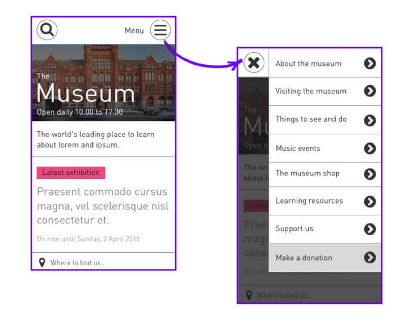
Before the client knows it, a site can have so many sections that they barely fit across the header on desktop, let alone at mobile. Alas the knee-jerk reaction here is to throw in the towel, and lean on the dreaded hamburger menu as a quick fix.
It’s because of this that great mobile-first website navigation first requires an intuitively structured information architecture.
What’s so bad about the hamburger menu?
We don’t have an issue with the interaction itself. A hamburger menu can be a perfectly reasonable solution for simple websites. For more content & feature-rich sites though, they can represent a missed opportunity.
Designers seem to be falling back to the hamburger as a ‘best practice’, without first considering more effective solutions. Truthfully, a hamburger menu can have many drawbacks.
They present a barrier to content discovery
Users who arrive on your site for the first time should be able to scan the contents of your navigation immediately. Having your nav items on show right away helps users to understand what it’s all about and gives them an earlier idea of whether your site is right for them.
If the whole contents of your navigation are hidden, it requires conscious effort from the user to see what’s inside. People have short attention spans, so this could be a big risk.
The ‘five second rule’ is an important guideline for UX designers. The idea is that after landing on your site, a user will decide whether or not they’ve made the right choice within five seconds. Hiding the whole contents of your navigation can risk losing people. First impressions are important, and your navigation forms part of this.
They encourage bad information architecture
The limitations of mobile force us to make difficult calls. With enough space to only show a few things in our nav, we need to think about what’s truly important. A hamburger menu removes this constraint, opening the flood gates for bad IA.
It becomes far too tempting to add “just one more thing”, because technically there’s nothing stopping us. With the navigation hidden under a hamburger menu, it can be made as lengthy as you want. There’s no incentive to consolidate or prioritise.
They require knowledge of a symbol not everyone understands
In spite of how common it’s gotten, many internet users still don’t know what the hamburger symbol actually means. In our technology industry bubble, we often take our knowledge for granted. If a user doesn’t know what this symbol means, you could have a usability issue on your hands.
They can slow down the navigation process
Using a hamburger navigation means an extra tap is needed to get around your site. It might only be a few seconds, but if you’re creating a service where people are likely to use the navigation several times it could be an issue. A social media site, for instance, will involve people doing the same actions many times. By having to repeatedly use a hamburger menu, you may being causing unnecessary inconvenience.
Let’s take an example
We’ve based this example loosely around an organisation we recently worked with. For the sake of anonymity, we’ll call them ‘The Museum‘.
‘The Museum’ already had a working website, but it wasn’t performing all that well. They’d recently launched a responsive redesign, but that only involved changes to the user interface. The information architecture hadn’t been readdressed in years. They’d only polished the surface layer.
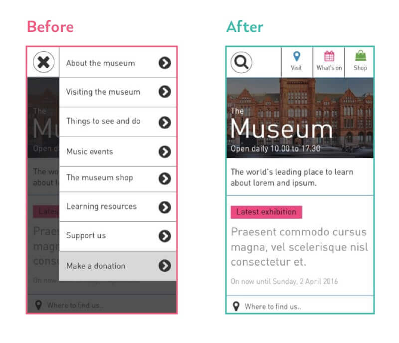
So whilst this new responsive design was technically ‘mobile optimised’, the IA was never been planned around this medium. That much was pretty clear when you see the eight different site sections, each with a pretty hefty title.
Focus on the information architecture
To improve the navigation, we need to pull back to a bird’s eye view of the website. Before even thinking about the user interface, we need to look at the overall structure.
I like to start a project by drawing a sitemap diagram of the existing information architecture. By viewing the site as a series of boxes and arrows, we avoid diving straight into the detail and can get a better idea of the big picture.
Feedback from users was that it wasn’t at all easy to find specific information.
The clumsy structure was further confounded by the necessity of a hamburger menu. Big problem when over 60% of the site’s traffic is mobile.
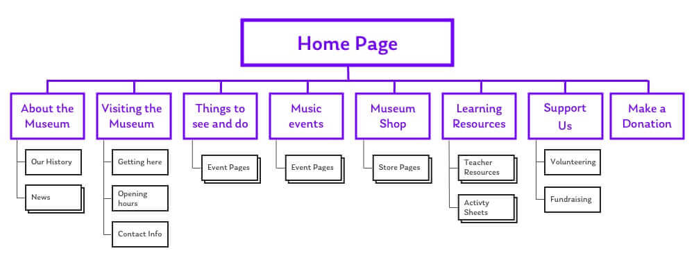
Looking at our sitemap, it was plain to see there were far too many choices for the user to make at the top level. This is what was making it a bad experience. Visitors just couldn’t pinpoint specific information or features.
We took five steps towards streamlining this information architecture:
- Step one. Do your research.
- Step two. Let go of the words.
- Step three. Consolidate.
- Step four. Prioritise.
- Step five. Test.
By working through this process we created the potential for a much more mobile-friendly site navigation.
Step One. Do your research.
Though we consider ourselves to be the experts, we’re flying blind without research. There’s a bit of a myth that doing user research is super expensive, and usually prohibitive for many projects. But that just isn’t true. There are so many ways you can get fast, cheap user research into your redesign process. This is particularly true when redesigning an information architecture.
There’s a few pain-free tools and techniques that we generally use to get some up-front data.
Analytics Tools
If the site you are redesigning has Google Analytics or something similar already set up, this should always be your first stop. Because they’re often seen as more marketing-oriented tools, analytics is often overlooked by designers. In fact, these are among the best research tools for UX.
By looking into our analytics data we can see :
- Which sections of the site people people use the most.
- Which sections that don’t get used by many people
- What the most popular content topics are throughout the site.
- What tends to get looked at earlier in the user’s journey, compared to what people look at later on.
- What people are searching for on the site and whether or not they’re finding it.
Tree-testing tools
Tree testing is a quick and easy way of assessing the ‘findability’ of content in your IA.
The method is simple. Wrangle a few willing participants (about 10 is often enough) and show them simplified ‘text only’ version of the site’s navigation. Ask the participants a series where they’d look to find specific kinds of information. In the case of ‘The Museum’, this might be something like “Where would you go to find out about wheelchair access”?
The participant points out which area of the site they’d expect to find that information. We then show them a list of sub-sections within the chosen area, asking them to pick where they’d go next, if applicable. We continue drilling down into the IA until the user finds that content.
By testing the IA in this way, we learn how accurately and easily people can answer their important questions.
This is also a great way of separating the testing of your content structure from any presentation or interface choices.
Our tool of choice for doing these activities is Optimal Workshop’s Treejack. It’s super fast and convenient, and you can set up tests for people to do remotely in their own time.
Then again, if you’re really stuck for budget just using pen and paper works too.
Open card sorting
Tree testing is a great tool for highlighting issues in an existing information architecture. The next step is to identify new ways that we could classify that information. Card sorting is super simple. All it takes is some sticky notes and a few willing participants.
Write the important content themes and topics on individual sticky notes. For ‘The Museum’ these topics included things like opening hours and current exhibitions. For this project there were about 30 of them – though this will vary for your own site, depending on the complexity.
Ask users to arrange and these content themes into a small number of groups of their choosing. Then, ask them to name each group in a way that describes the content. After that, ask participants to prioritise each group in order of importance.
After you’ve done this with a few different people, you should start to notice patterns around how users group and classify your information. This can be used to inform decisions about how the redesigned site is structured. Usability.gov has a fantastic breakdown of the card sorting method, if you want to learn more.
Now that we’ve got plenty of data to support our decision-making, we can start refining the information architecture.
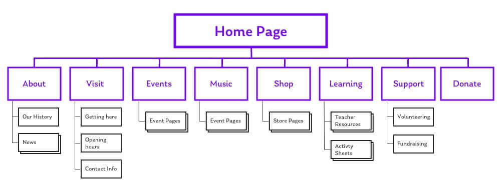
Step Two. Let go of the words.
A site’s visitors don’t have time to read an essay. Many barely read at all.
People are much more likely to scan, looking for key words that drive them toward what they actually need. Keeping our top-level navigation items scannable is of massive importance. ‘The Museum’ put far too many words into each site section, making the top-level navigation impossible to digest at a glance.
Step Three. Consolidate.
This is where that our research starts coming in really handy.
When we did our card sorting, it’s likely that we found many content themes that overlapped and naturally grouped together.
By grouping some of the similar topics into single, broader areas we can reduce the number of options given to our visitors. Having fewer options reduces the risk that they’ll make the wrong selection, and further improves ease of use.
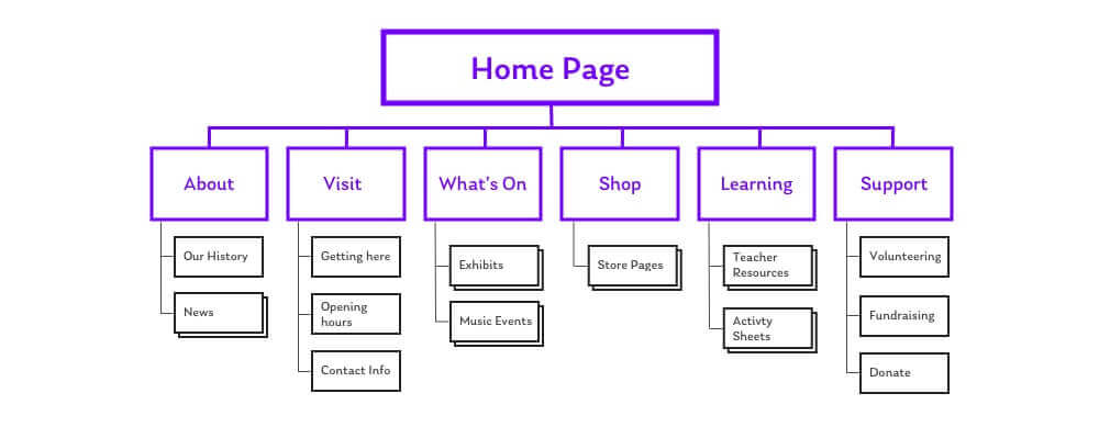
’The Museum’ previously had separate top-level choices for “museum events” and “music events”. We consolidated these into a single, broader section called “what’s on”. Likewise, the different ways of supporting the museum were previously split out. We merged them into one area called “support us”.
Every time we remove an item from the top level, the remaining ones become that much more prominent. This speeds up the initial decision making process for users.
Step Four. Prioritise.
Is every section of equal importance to users?
This might seem like a tricky question, but if we’ve done our research we should already know. Using our data, we’ll know which topics and themes visitors value the most. This prioritisation can be used to split our navigation out into primary and secondary groupings.
The primary sections will want to be really clearly visible right away – probably in the header.
The secondary sections might have a more niche appeal, and could go in the footer or somewhere else slightly less prominent.
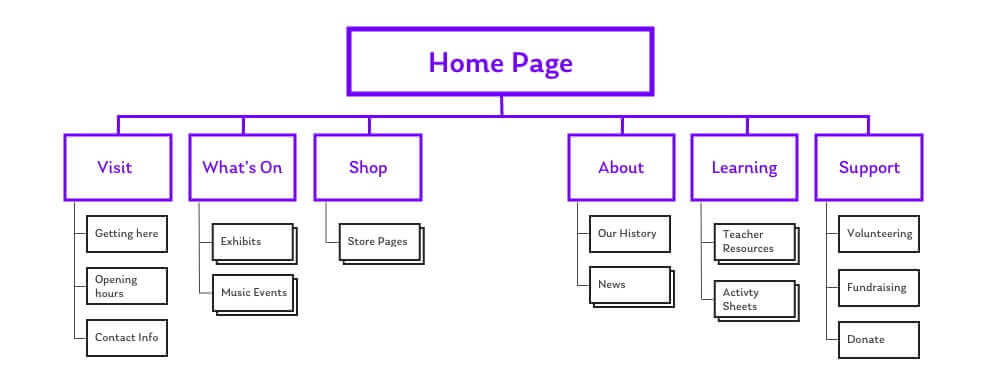
For ‘The Museum’ it turned out that “Visit”, “What’s On”, and “Shop” represented the most high priority user needs. “About”, “Learning” and “Support Us” were seen as being less important. We made the decision to move these secondary sections into the site’s footer. They were a bit more niche, and didn’t need to clutter the main navigation for the majority of users.
Step Five. Test.
We’ve made a lot of progress with the information architecture, but now it’s time to stop and take a sanity check.
Remember the tree testing activity I talked about in the user research step? Well, it’s time to repeat that – only now we can do so with our revised site structure. By giving participants the same tasks with the new structure, we can see like-for-like how effective it is in comparison.You’ll also probably find that there were some incorrect assumptions. That’s ok.
Nobody gets everything right the first time, and it’s better to catch these issues now rather than later.
We did a couple of rounds of tree testing for the new structure of ‘The Museum’. The IA was tweaked slightly each time, in response to feedback.
The Results
From this process we’ve gone from eight long links in our header navigation, to three single-word sections in our header and three more in our footer.
Now we can finally go back into the user interface. By having a streamlined information architecture, we’ve got far more flexibility to show navigation in a mobile-friendly way. It meant we could bin the hamburger and have three concise links shown right there in the header. Things look clear and smart, even on tiny screens.
This new presentation means users can quickly scan the navigation, and get to those key areas really easily. Simple, right?
If you need some more inspiration, we’ve put together a post sharing some more examples of sites who have implemented awesome mobile-first navigation. Good luck, and happy information architecting!

Chris Myhill
— Director of Experience