Blog The paradox of choice. Why more isn’t always better
Humans are trained to think the more, the better. But too much choice can prevent decision-making, and cause usability issues.
There’s a well-known study in the field of consumer psychology about choice.
Conducted by Columbia University, the study examined how giving customers more choice affects their likelihood to make a purchase. In the experiment, customers of a Bay Area supermarket were given a selection of 24 deliciously different jams to sample and buy.
On a different day, that selection of jams was reduced to just 6 flavours. Researchers found that, contrary to expectations, the reduction in choice meant significantly more sales.
Similar results have been found in other industries, too. Barry Schwartz cites an example where companies offering more choice for staff pension schemes see a reduction in uptake from their employees. The choice stressed people out, and stopped them from wanting a pension in the first place.

Too much choice is stressful
It boils down to this. Too much choice paralyses decision-making.
When people are too overloaded with information, they can’t process it effectively. Deciding becomes a chore, so they choose not to decide.
For designers, this kind of behaviour isn’t good at all. For our products to be usable, decision making needs to be frictionless. Many teams still hold an idea that ‘the more, the better’ when it comes to navigation, features and content.
The thing is, this attitude weevils it’s way into user interface in a really bad way. For example:
- Adding too many links to a website or app’s navigation.
- Cramming content ‘above the fold’.
- Using carousels and the like to bombard the user with more of what we want them to see… But not necessarily what they need.
- Giving people this much choice increases cognitive load. It bamboozles them.
They’re not sure where they should go, or how they should take action. Just like having too many jams in a supermarket, it results in users deciding against making a choice.
In other words, they leave.

Give my brain some breathing room!
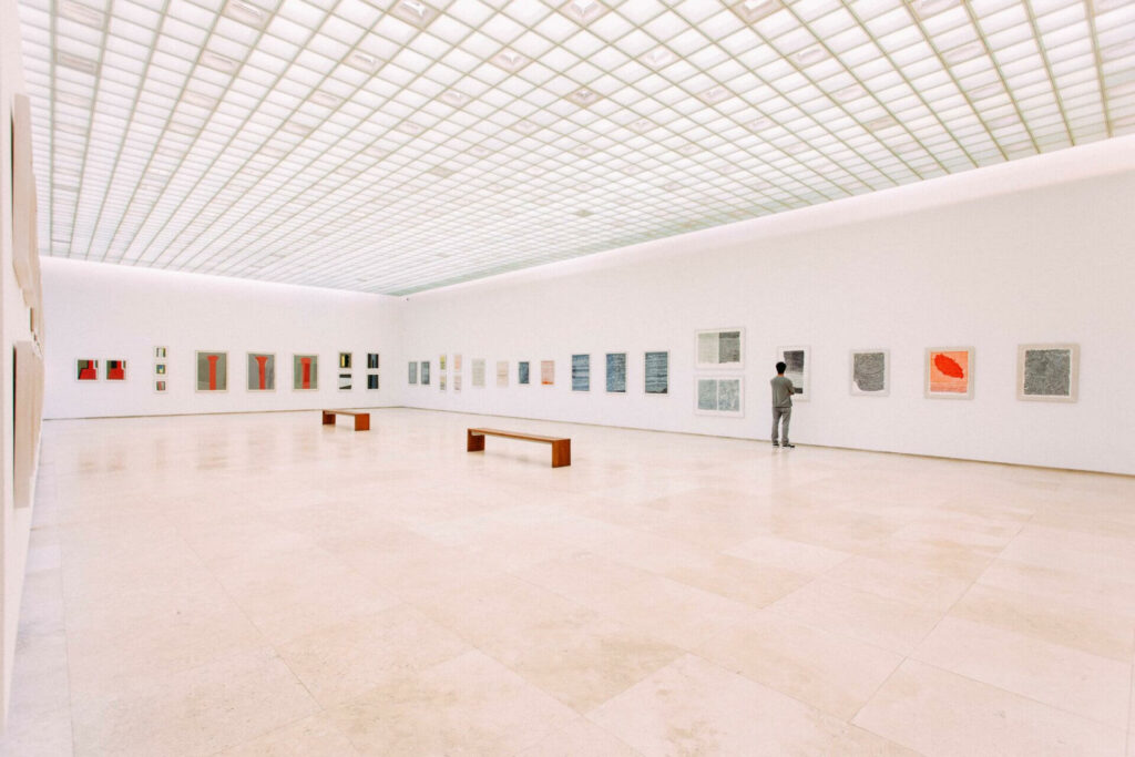
When it comes to UX, there’s a lot we can learn from the design of physical spaces. Some of my favourite examples are art galleries.
Galleries can be huge structures, but the paintings and exhibits they contain take up a very low portion of the available space. Why is that?
Take the Tate Gallery in London. It’s a huge building. They could quite easily hang half their collection in the entrance hall. The ‘above the fold’ logic would support this decision, too. If there’s space to show the user more stuff straight away – we should, right? Well, no.
Galleries deliberately provide large amounts of space between exhibits. This is so that visitors can digest and appreciate the content. Negative space helps people process the information they’re taking in, without feeling overwhelmed.
The whole setup is designed to prevent distraction and stress.
Many galleries and museums go one step further. They provide empty rooms between exhibits where visitors can reflect, take a break, and give their brains a rest. The fewer choices you provide people with, the more you permit them to make decisions.
It’s not about ‘number of clicks’
Let’s start talking about the web.
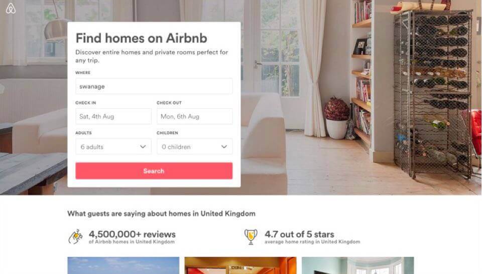
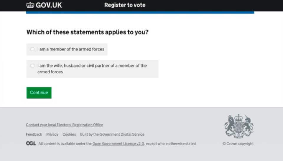
I’ve been given countless website redesign briefs where clients have asked to make certain information ‘available in three clicks’. This attitude needs to be challenged, because it actually hurts usability.
In an effort to reduce the number of clicks to an outcome, interfaces end up being cluttered. We’re forced to put more on the page, and provide more options at once. The interface quickly becomes confusing and overwhelming, and it’s because we’ve tried to rush things along at the expense of our user.
Instead of thinking in arbitrary actions like clicks, we should instead rephrase objectives as “how can we get the user to an outcome with as little friction as possible?”.
This can result in slightly longer processes, it’s true. But they’re more stress-free processes. We avoid placing extra cognitive load on our users where they’re forced to weigh up loads of choices at once.
Less is more
The principle of ‘less is more’ can be applied to so many areas of UX design.
- When planning IA and navigation, be as concise as possible. Funnel people through to relevant areas where choices can be more focused.
- Use white space and visual hierarchy to give users a bit of mental breathing room. The more information you show at once, the harder it is to digest.
- Break big tasks into smaller parts. This reduces the cognitive load you’re putting on a user at any one time. Above all else, prioritise. Show the right information at the right time, and cut the noise.
By taking a more focused approach to design that requires fewer choices from users, they’ll be less stressed… and much happier for it.

Chris Myhill
— Director of Experience