Blog ‘Poka-Yoke’ Design, and the art of error-proofing
This amazing product design principle is something we should all aim for. Don’t respond to errors – prevent them!
There are lots of funny sounding concepts that get thrown around in our industry.
For those just starting out in the world of tech, this secret language can be pretty confusing. For this reason we try to avoid talking about contemporary design principles where possible. In fact, avoiding jargon is one of our core values at Pixel Fridge.
Just this once though, we’re going to take a bit a mild exception… Because this one is interesting. We’re talking about ‘Poka-Yoke’. It’s the Japanese term for ‘error-proofing’, coined by Toyota engineer Shigeo Shingo.
This one gets a pass because it’s such an important ideal for good UX design… Also, it’s just so damn delightful to say.
What does it mean to be error-proof?
When designing websites & apps, we can spend a lot of time planning for errors.
- We write error text for our forms.
- We style problem states, showing what happens when things break.
- We try to help users recover quickly when something goes wrong.
This is all good practice, but it doesn’t prevent the initial frustration of the error itself.
A Poka-Yoke design is one that prevents the error occurring in the first place. It does this by making sure that error-causing actions are literally impossible.
Poka-Yoke for product designers
Poka-Yoke originated on Toyota’s production lines, so naturally it’s a popular principle for product designers.
Every day, people interact with Poka-Yoke designs, without thinking about it. And that’s the point. When a design is error-proof, no thought is required on the part of the user. There’s no possibility of them making a mistake — so they don’t need to think.
Examples of Poka-Yoke in everyday products include :
- A three-pronged plug. By avoiding symmetry, there’s only one way that that plug can go into the socket.
- A microwave. It can only be switched on after the door has closed, and stops automatically when the door is opened.
- A bathtub. There’s a sink plug at the near the top, so it can’t overflow.

Poka-Yoke for interaction designers
When designing digital products, there’s so much we can learn from this way of thinking.
Deep-rooted computer science thinking has trained us to expect errors in digital products. Whilst computational errors are sometimes inevitable, they shouldn’t bleed into the user interface design.
Next time you’re designing an error state, think about how you could tweak the interaction to stop that error from happening in the first place.
Examples of Poka-Yoke in UX design
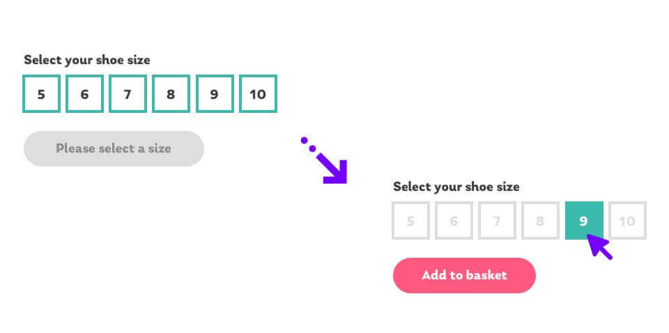
Selecting a product size before adding it to the basket
Think about an eCommerce site selling shoes. it’s necessary for the user to select their shoe size before adding it to the basket.
On many websites, the user might get an annoying error message if they hit the ‘add to basket’ button without first selecting a size. Instead, we can error-proof this interaction by disabling the ‘add to basket’ button until after the size has been chosen.
To help draw the user’s attention to the size choice, the initial state of the ‘add to basket’ button could instead read ‘please select a size’. After selecting a size, the button then activates. We can use animation and styling to draw the user’s attention to the change.
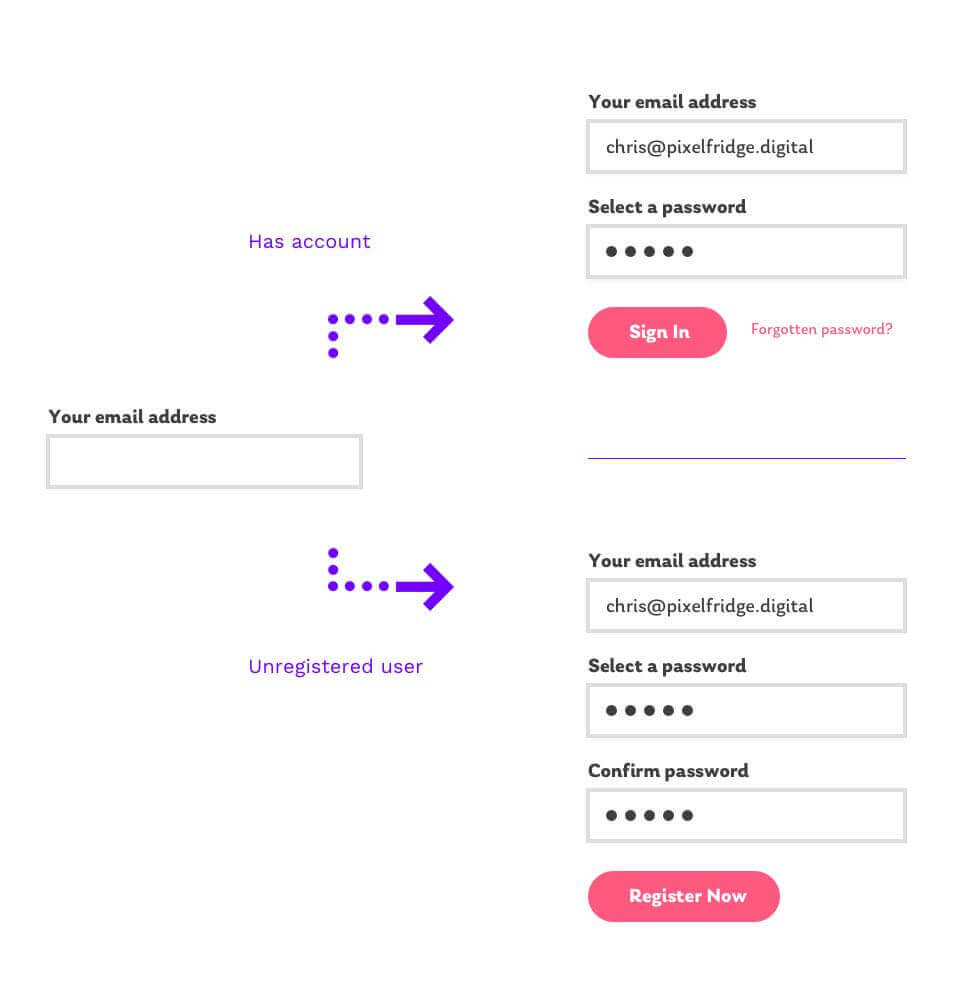
Trying to create an account with an email that’s already registered
Lots of websites and apps have account functionality. Many sites cause issues by separating the ‘login’ and ‘register’ forms.
Users could accidentally find themselves trying to create an account when they meant to sign in, or visa versa. They could also forget whether they are registered in the first place. Needless to say, all of these scenarios could result in some frustrating errors.
Instead, we could try providing a single field that asks the user to enter their email address.
After the email address has been entered, we check our database to see if that email address has been registered. If it has, we show the login form. If it isn’t, we assume they’re a new user and allow them to register. Simple!
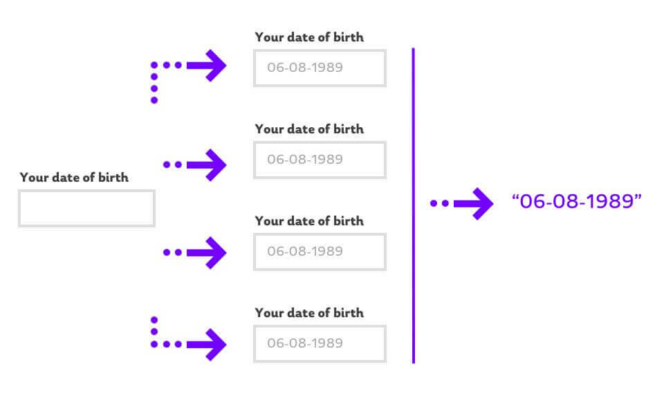
Catering for different input formats for a date field
Form usability can be a tricky beast. From a validation point of view, we need information to be entered into a database in a single, consistent format. The need for structured data has historically put an onus on the user to ‘get it right’.
For example, let’s say the user needs to enter their date of birth on a registration form. There are loads of possible formats that this could use to supply this.
Say my birthday was the 6th of August, 1989. This could be entered as :
- 06-08-89
- 06-08-1989
- 06 August 1989
- 6th August 1989
…And so on.
A tooltip could suggest the required format, but it doesn’t stop them from getting it wrong. If the user tried to enter their birthday in a format we can’t use, we throw back an error. How rude!
Instead, we can put in a little extra effort to error-proof this interaction. Our ‘date of birth’ field could allow the user to enter it in any known format. By recognising different possible formats, we can then convert it behind the scenes into the format the database needs.
We can still provide a suggestion or example of a date format, but now it’s just to be helpful.
Stop preparing for errors, and start preventing them
Hopefully this has gotten you thinking more about error prevention, rather than just error recovery.
We still need to plan for edge cases, but errors are very often avoidable. Poka-Yoke is a fantastic attitude that all product creators should be aware of.

Chris Myhill
— Director of Experience